Book 1:
 |
| Photomontage. By Dawn Ades, 1976. Published by Thames & Hudson Ltd. |
"It was common practice in the nineteenth century to use combination printing to add figures to a landscape photograph, and to print in a different sky. Not all photographers regarded these practices as legitimate: the members of the Photographic Society in France were banned from exhibiting composite works." - pg11
"The term 'photomontage' was not invented until just after the First World War, when the Berlin Dadaists needed a name to describe their new technique of introducing photographs into their works." - pg12
 |
| A Short Sharp Shock. By David King, 1980. I like how the artist has used the symbols from the communist flag to represent the idea. |
 |
| Metropolis. By Paul Citroen, 1923. I love how the artist has juxtaposed a heap of different photographs to create tightness, tension, and chaos. |
 |
| Modern City: Melting Pot of Life. By Kazimierz Podsadecki, 1928. I think this composition/ layering of photographs creates a really interesting silhouette. |
 |
| Montage of scenes from the film Metropolis. By Fritz Lang, 1926. The use of negative space really highlights the chaos and clutter of the 'Metropolis'. |
 |
| The Torrents of Spring. By Marcel Marien, 1966. I find the substitution of hair for water flowing out of the tap quite interesting and unusually beautiful. |
Book 2:
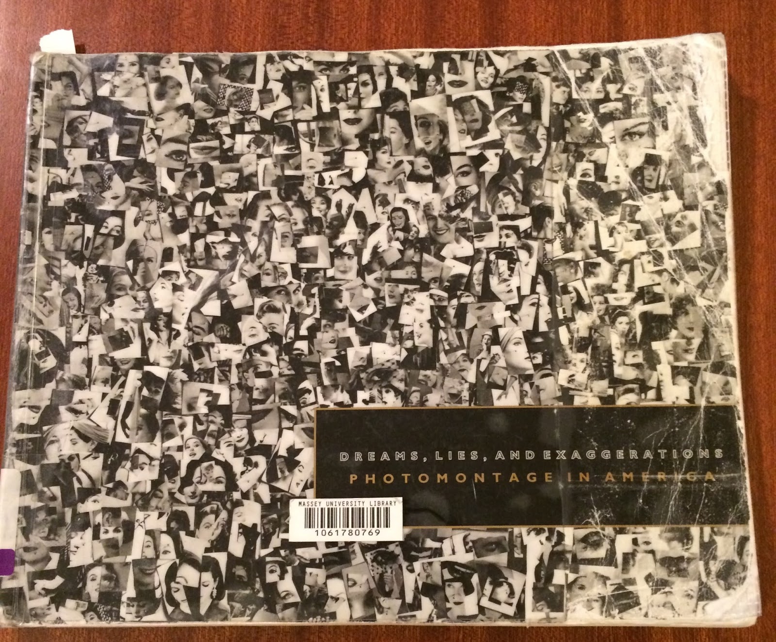 |
| Dreams, Lies, and Exaggerations: Photomontage in America. By Cynthia Wayne, 1991. Published by The Art Gallery, University of Maryland at College Park. |
 |
| Detroit. By Harry Callahan, 1943. I like the ghostly effect of the multiple layers of this image. It really implies speed and time passing to me. |
Book 3:
 |
| Composite Landscapes: Photomontage and Landscape Architecture. Published by Isabella Stewart Gardner Museum. 2014. |
 |
| Pueblo Bonito, Chaco Canyon, New Mexico. By James Corner, 1994. I like the use of graphs as well as photographs to represent an idea. |
 |
| Windmill Topography. By James Corner, 1994. I like how this image layers landscapes, full-shots of the subject matter, and graphs and data to portray and idea. |
 |
| Mask XLVI. John Stezaker, 2007. I am drawn to this image as her face had been hidden. I also like how the shape of the landscape in the photo placed over-top looks like it is emulating the slope of a forehead and nose. |
 |
| Lake/City/Horizon, Toolonlahti Park, Helsinki. By James Corner, 1997. I like the cropped 'cut and paste' look of this piece. |
Book 4:
 |
| Visual Alchemy: The Fine Art of Digital Montage. By Catherine McIntyre, 2014. Published by Focal Press. |
 |
| Photomontage on Introduction title page. I like how there is layered photos and detail contained within the hand-print. I feel like it tells a story about the person who created the print. |
"Digital montages are ideas become visible. You are operating somewhere between imagination and a physical reality. Developing pictures are in a state of flux, not yet existing in a hinterland of intangible code, moving both forwards and backwards in time. Digital art blurs realities. By using photography and other ways of recording actual things, the pictures can seem 'real' by virtue of their 'real' content while being entirely fantastical. The fantastical, when a representation of an inner emotion or motivation, is a different kind of truth."
 |
| Loteria 1: La Rosa (Lottery 1: The Rose). By Luis Gonzalez Palma. I like how the artist has used sepia tones to age the subject. I feel that the wreath around the girl's head really draws the viewer's attention directly to her face. |
 |
| Ice White. 2004. There are only two components to this very simple piece, the portrait and a photograph of a frozen Scottish puddle. I think that this layering is quite simple, but very intriguing and beautiful. |
 |
| Pool. 2012. A combination of three photographs. I like how the layering has sort of distorted the facial features. I also like how the face looks like it is emerging out of the darkness. |
 |
| Portraits of African, Asian, and European women. I think the ghostly layering in this image makes it more mysterious and intriguing therefore more appealing to examine. |
 |
| Queen Ant. 1998. I like the layering a textures. |
 |
| Isis. 2004. This is an imagining of Isis, the Egyptian goddess, whose name means 'throne'. The shape of the cut-out echoes that of her hieroglyph. Egyptian sculpture shows an uplifting delight in the human form. I like the colours and textures in this image. |
 |
| Le Vase Brise. 2011. The reference to an ancient civilisation and the stone-like body paint point up the classicism of the pose, in which the hand delicately hides the breast, while also drawing attention to it. I like how the figure is merging with the darkness. I also like how the layering of two images has given their skin a really interesting texture. |
 |
| Birdcage. 2010. A nude is more enigmatic without a face from which to gauge mood. A single studio light was focused on the model through a bird cage for this shot. I like how the artist has used just one prop and light source to get this beautiful pattern on the model. |
 |
| Femme Voilee. 2008. A sheet of Egyptian newspaper, found on the banks of the Nile, is combined here with a nineteenth-century postcard image of a veiled woman. I like how just two images can be combined to convey an entirely new idea. |
 |
| A White Sheet of Paper. 2005. Drawing using black and white ink on brown paper super-imposed on a photograph of a model in the same pose. I am intrigued by the idea of combining a photograph and a drawing. |
 |
| The Telepath. 2005. I like the layering of colour and texture in this piece. |
No comments:
Post a Comment