Looking at Hue/Saturation, cropping, and layout:
Looking at creating montages:
 |
| Inspiration: Work by Natalie Nicklin |
 |
| Looking at using a Natalie Nicklin style of overlaying |
 |
| Inspiration: From the Daniel Regan typeB photo series |
 |
| Looking at breaking up the circle |
 |
| Looking at Fong Qi Wei's techniques again |
 |
| Looking at overlaying text like my some of my first works |
 |
| Inspiration: "Asterisms are star patterns. Artist Christopher Willey created his asterisms by mapping the freckles and moles of his friends." |
 |
| Using dots in the style of Christopher Willey |
 |
| Inspiration |
 |
| Inspiration |
 |
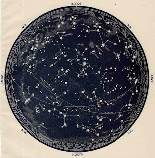
| Looking at using a style like astronomy maps to represent moles and sunspots |
 |
| Inspiration |
 |
| Inspiration |
 |
| Looking at trying to make my images feel like scientific specimens |
 |
| Inspiration |
 |
| Inspiration |
 |
| Inspiration |
 |
| Inspiration |
 |
| Looking at putting a mole map on the image |
 |
| Going back to looking at overlaying scientific text - like some of my earlier work |
 |
| Cropping into the shape of text |
 |
| Cutting text out of the image |
 |
| Cropping into the shape of a mole |
- I tried out all of these concepts to see if I could find a way to enhance my images and the ideas within them with digital montage, but I think they are overcooking my ideas and making them too obvious. I like that my photographs are ambiguous and have a simple elegance. These feel too forced and start to look amateurish. I don't like that most of these concepts really start to hide or break up the photograph as the textures, shapes, and colours in the photograph are the most important thing.


No comments:
Post a Comment